Product Update: November
TL;DR
- Improved Pipelines for PowerBI, Tableau & Looker
- Drill down into Snowflake costs
- Try a workspace (exciting!)
Welcome to November’s Product Update, who is in denial that it is December this week?!
This month is all about managing your data in two new ways: more shareable data and data usage analysis.
The Data Platform work that we are doing to bring data together is now the core part of our offering for customers who want to share data with people outside of the organisation. And while we still use the language of “Data Ownership” the accountability for accuracy is a huge block to progress: no one wants to share data they can’t rely on.
Read on for the full update:
Improved Pipelines for PowerBI, Tableau and Looker
Data platforms need data that is good enough to share. Our workspace gathers data from your favourite apps and in many cases improves your experience of them.
This month we have been working on connecting BI tools. If you already have PowerBI, you are unlikely to change, but we keep hearing about frustrations with the unreliability of the data.
Matatika moving your data into PowerBI will increase reliability for analytics engineers and allow analysts more access and feel less frustrated.
Example: we move the data into Snowflake in just a few clicks. The raw data becomes automated and more structured and appears in PowerBI with increased reliability. The workspace data is available for the analysts to interrogate in much more detail and more independently.
We build everything in models (vs from scratch) so that they can apply in multiple cases. Here, the same model can be applied to Looker or Tableau if that is your preferred app.
Early customers to adopt the plug-in have called it a data dictionary or a data catalogue. Someone might have even called it a work of art… but we don’t want to brag.
We have twelve templates containing collections of the most useful data sets available to plug in and start using immediately, getting a project started in a matter of days. Then, once you know what customisation you might need, you can build it with a little extra technical knowhow.
Drill down in your Snowflake costs
The CFO asks why the Snowflake invoice is increasing month on month. You know data usage is up but the information presented to you doesn’t show the detail?
We are Snowflake partners, and endorse its use as a Data Warehouse but also agree that information is limited when you are looking for efficiencies. By reporting the data into a workspace on a more regular basis (daily), the data broken down will tell you a much richer story.
The nice thing about fixing this problem, is that it was also a problem we had found ourselves . Investigating our own costs has meant a 10x saving on usage time in one area and we have re-routed some testing to a more cost- efficient platform.
And what does the data look like in our app? We are so glad you asked.
Have a look at this:

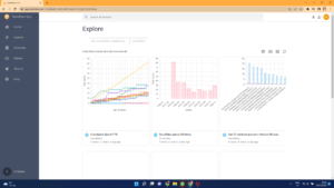
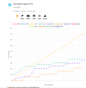
This is a Matatika workspace as it would appear on your desktop (vs mobile version). Immediately you are drawn to the Snowflake spend change where March (the first month of use) shows a high spend. That’s the yellow line which looks like it’s trying to escape the graph!
When we realised this we investigated and brought the cost down in April by changing the way we used it.
And we could see it was working. Improving month on month, we managed to reduce our costs by 60% in this area. Boom!
What is really exciting is that you can view this data live in our workspace. We have sent the link out to our mailing list to explore. If you would like to have a poke around yourself, drop us a note via any of our channels and we will happily oblige.
Connect to Apps & Data now
Use Matatika to rapidly produce insights from more than 500+ apps and community sourcesData Leaders Digest
Stay up to date with the latest news and insights for data leaders.

